
Today, creating high-fidelity, clickable prototypes is a best practice in product development. The theory is that by making something look real without spending the time to actually make it real, we can iterate ideas faster and ship the right product sooner.
Recently however, my business partner Keith and I built an app - start to finish - without ever touching Figma, Sketch, or Illustrator. And hot take...I actually think it helped us ship a better product faster to our users.
I know, absolute blasphemy. But in this post, I want to explain why prototyping with tools like Figma might actually be slowing down your product development (🚨) and give you 3 alternative strategies to use when prototyping products (✅).
Let's get started by admitting that...
🚨 Figma's fidelity is distracting.
Figma is a powerful program that allows us to create interactive prototypes that look and feel like real applications. This helps us fully visualize and get feedback on every detail of our designs before writing any code. However, I'd argue that this level of fidelity can be a huge distraction in the early life of a product.
Building great products is a mental game. It's about maintaining focus on the right questions at the right time. And at the beginning of the process, the only design questions we really need to answer in order to create a testable prototype are ones of scale, position, and copy: How big should this be? Where should it be? What should it say?
Now don't get me wrong, design details like color, typeface, animation, and depth can dramatically affect the customer experience; I'm just saying that they are rarely the tools that solve the critical path for our users.
The problem with Figma is that it prompts us with the important questions and every other design question at the same time: What color should this be? Should this card have a drop shadow? What happens when we hover? What font best expresses our brand's tone?
And as designers, its extremely tempting to spend hours exploring these details because they are often what make our designs interesting and unique. Answering them is often the part of the job that allows us to express ourselves and feel like artists. But the hard truth is that our customers won't care about these details unless they're icing on a cake that saves them time, makes them money, or prevents their pain.
So, how do we stay focused on answering the design questions that matter most in the face of Figma's fidelity? Well obviously, we could simply try to be more disciplined, resist the temptation, and ignore the distracting questions Figma asks of us in the early stages of the design process.
But I'm going to suggest that we just use a different tool and...
✅ Remove the ability to add fidelity.
Working within a less powerful tool creates constraints that focus our attention on the core questions of our early prototypes. There are a variety to choose from, but my favorite is Excalidraw. It's free, open source, fast and fun.
Excalidraw allows you to draw shapes, write text, and group elements all on an infinite canvas. The "catch" is that you have access to a very limited color pallette, and every element on screen looks hand-drawn by default. In this way, sketches in Excalidraw focus discussions amongst you, your team, and your users around how your product works before focusing too much on how it looks.
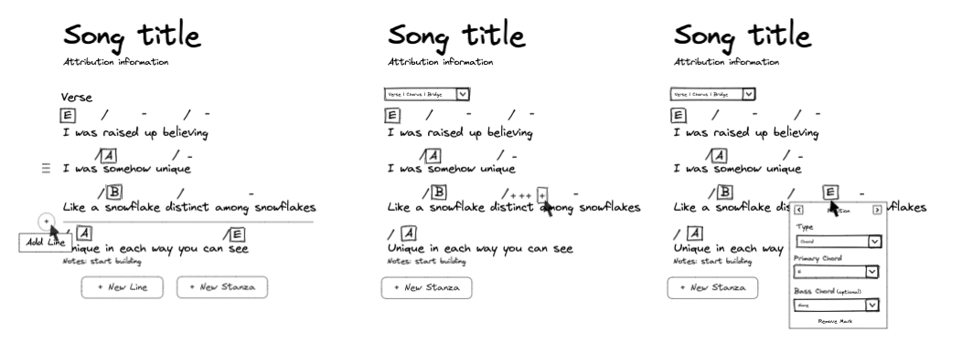
For the app Keith and I worked on, we used sketches like the ones above to get feedback from our users on functionality, and then actually answered those design detail questions after we had started writing code. Now, I will say that we can do that because we're a small team and my background in motion graphics helps me make those design decisions on the fly.
But you can still make a similar system work on larger teams by having a dedicated designer finalize page mockups in Figma while engineers focus on making the feature work with the sketches as scaffolding. Then, once the designer is done, the frontend engineers can go back and add in the extra levels of detail.
However, just be careful when moving your designs from low to high fidelity because...
🚨 Figma can cause scope creep.
Engineering heavy product teams often have a "bias towards building". At face value, this seems like a good thing in an industry that often praises speed over anything else. However, a "bias towards building" often leads to scope creep.
Scope creep is when we lose focus on what actually matters to our customers and start packing every idea we have into our products. It's a deadly disease that leaves our customer base fragmented, our code base messy, and slows down our development velocity over time.
Prototype testing with a program like Figma is often cited as a solution to scope creep because it prevents us from jumping in and writing code. The theory is that by focusing on the user experience instead of implementation, we'll ask questions about usefulness earlier in the process and make more informed decisions about priority and scope. But in practice, this rarely happens.
What actually happens is that - instead of packing features into our products - we just start packing features into our prototypes. And although jumping into Figma might feel better than jumping into code, the outcome is still the same.
Our overstuffed prototypes - although less costly than overstuffed products - still give us no clarity over priority and scope. In fact, they can actually make it harder to answer those questions because once things are in a unified UI, it becomes much harder to see how aspects of our apps can be split apart and built iteratively.
The good news is that the solution to this problem is simple...
✅ Define the elements first.
A tool that I like using for deciding scope and resolving priority is breadboarding. It's a technique for sketching out the flows and capabilities of our products without thinking about UI at all.
There are three pieces to a breadboard diagram like the one shown below: places, affordances, and connections: Places are the underlined headings that represent screens, sections, pages, and popups. Affordances are things within those places that the user can see and interact with - like buttons, links, form fields, and text copy. Connections are lines that show where a user goes after interacting with an affordance.
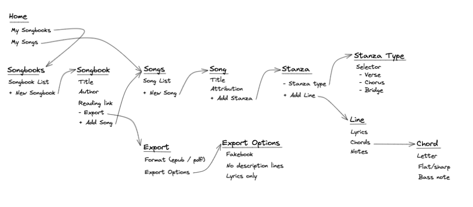
By putting these three pieces together, we can essentially create a system diagram of all the core elements in our application. This enables us to have clear conversations about scope and priority without getting lost in the design details present in a polished prototype.
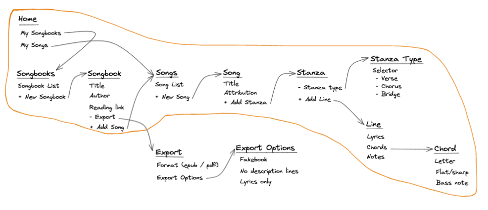
For example, with the diagram above, Keith and I were easily able to discuss and decide what features belonged in the first release of our app. We noticed there were two diverging paths from the Songbook place: one to create songs and one to export the songbook. Since the export feature wasn't along the main happy path of the app, we decided to cut it out of scope and only focus on the ability to create and view songs and songbooks.
And with scope decided, we could then discuss priority. We used the diagram to step through and identify the most important or unknown areas of the product. For our purposes, Keith and I decided that was the actual Song and Stanza editor since that was the element we knew was most important to get right for our users.
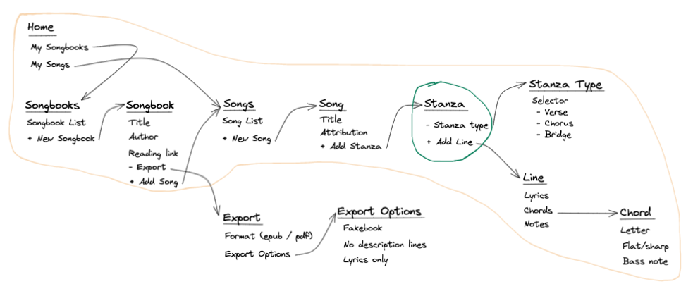
So, we built that first. From there, it was just a game of repeating that process with the next most important piece while getting feedback along the way from our users. And in our case, that means Keith and I never built a full, high fidelity prototype of the product.
And if we had, I doubt what we ended up building would look exactly like that design. Which leads me to my next point...
🚨 Figma can create confusion.
At most companies I've worked at (including my own), there's usually one Figma prototype for the whole product. We build them this way to have a mock representation of our applications - a kind of design spec that attempts to express both the current state and future direction of our product. But as we actually start shipping code, our prototype and our product often diverge.
We change aspects of features and designs rapidly in development in order to cut scope, simplify a solution, meet a deadline, or even just tweak brand copy. Which means - unless we're incredibly diligent about keeping the two in sync - our prototype no longer represents our actual product. And if we continue operating as if it does, we end up making internal communication more difficult and user testing less valuable.
Design discussions with other teams become more difficult because we have to constantly be remembering and calling out what's still relevant. At best, this causes mild confusion and frustration for members of the team. At worst, it can leave important spokespeople - like your sales team or your CEO - with a false sense of what's real and what's "just a prototype".
Externally, it can also make user testing less valuable. Users that are comfortable with our products will often notice even the slightest differences in our prototypes. And those inconsistencies can be a big distraction during a user interview. At best, this can skew the feedback we're gathering about a new feature or flow. At worst, it can cause us to come to the wrong conclusions about a feature's usability.
The obvious solution is to keep our prototypes in sync with our products. But in practice, this is tedious, exhausting and unsustainable. To me, it's better to take a different approach - to stop forcing Figma to fully mimic our applications and start working with the mindset that...
✅ Prototypes are a playground - not a product spec.
In order to solve these issues, I want to suggest that we stop focusing on making our designs in Figma perfectly match our products and making our products perfectly match our designs in Figma. Doing so simply creates more trouble than it's worth. Instead, I think we should play to the strengths of Figma and treat our prototypes as what they are: pictures.
They're drawings of what could be. Clicking through them is an exercise in thinking about what the user could experience. And that's how we should talk about them. Because when we try to treat Figma as a representation of what our product will look like, we create confusion internally and create documentation problems down the line.
When we treat Figma as an exploratory tool, we can also free ourselves from working in a single canvas. We can use Figma's components architecture to create a unified design system, and then section our ideas and concepts into different pages. This enables us to iterate, dive in, duplicate, and be messy because Figma is now a brainstorming tool - not a source of truth.
By keeping our product as the single source of truth, it also makes the process for user testing more clear. When we have a new feature or flow we want to test, we recreate the relevant pages of the app at their current state and tack on only the changes we're testing. With a robust component system, this process is quick and ensures that we don't confuse the user or skew their feedback in unwanted ways.
Thinking about Figma prototyping as a playground instead of a product spec opens up whole new ways of working that enable better collaboration amongst our teams and creativity from our designers.
Now, before I end this post, I want to make something explicit...
✨ Figma is awesome.
As much as it might seem like I've just dunked on the program for 2,000 words, I want to be clear that I think Figma is a fantastic tool. The point of this article was simply to share the pitfalls and foot guns that I've experienced working with it as part of the product process.
Figma is powerful, but with great power comes great responsibility.
👋 What do you think?
I write to share what I've learned and spark conversations that help me learn from others. I know some of the ideas in this article are controversial. So, I'd love to hear what you think of them on Twitter or LinkedIn. You can also email me if social media isn't your thing.
Also, if you want to get notified the next time I post an article like this, you can sign up for my newsletter using the form down below.
Until next time.